Configuration Options – Column Formatting
So far, we have seen how to enable filters, footers, paging, print, preferences and more. In this section let’s look at a very common requirement, one that of formatting column values. Depending on your situation, there are numerous ways to customize the content of the cells. We provide you with a rich API that allows you to pretty much customize every single grid cell.
There are a number of options that the grid exposes to let you control the content of each cell:
<code>dataField</code> property, or gets the string value of the data object.
Now that all of this is said, let’s look at what the typical markup for each of the above options looks like:
configuration: '<grid id="grid" enablePrint="true" enablePreferencePersistence="true" enableExport="true" forcePagerRow="true" pageSize="50" enableFilters="true" enableFooters="true" >' +
' <level>' +
' <columns>' +
' <column dataField="id" headerText="ID" filterControl="TextInput" filterOperation="Contains" footerLabel="Sum: " footerOperation="sum" footerOperationPrecision="2"/>' +
' <column dataField="type" headerText="Type" filterControl="TextInput" filterOperation="Contains" footerLabelFunction="myCompanyNameSpace.customFooterFunction"/>' +
' <column dataField="" headerText="Label Function Example" filterControl="TextInput" filterOperation="Contains" labelFunction="myCompanyNameSpace.labelFunctionExample"/>' +
' <column dataField="" headerText="Label Function 2 Example" filterControl="TextInput" filterOperation="Contains" labelFunction2="myCompanyNameSpace.labelFunction2Example"/>' +
' <column dataField="active" headerText="Item Renderer Example" headerRenderer="myCompanyNameSpace.CheckBoxHeaderRenderer" filterControl="TextInput" filterOperation="Contains" itemRenderer="myCompanyNameSpace.CheckBoxRenderer"/>' +
' </columns>' +
' </level>' +
' ' +
' </grid>',
You will notice that we have highlighted a few important items here:
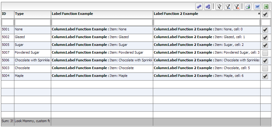
myCompanyNameSpace.labelFunctionExample = function (item, column) {
var html = "<b> Column:"+column.getHeaderText()+" : </b> Item: " + item.type ;
return html;
};
myCompanyNameSpace.labelFunction2Example = function (item, column, cell) {
var html = "<b> Column:"+column.getHeaderText()+" : </b> Item: " + item.type + ", cell: " + cell.rowInfo.rowPositionInfo.getRowIndex();
return html;
};
/**
* Flexicious
* Copyright 2011, Flexicious LLC
*/
(function(window)
{
"use strict";
var CheckBoxRenderer, uiUtil = flexiciousNmsp.UIUtils, flxConstants = flexiciousNmsp.Constants;
/**
* A CheckBoxRenderer is a custom item renderer, that defines how to use custom cells with logic that you can control
* @constructor
* @namespace flexiciousNmsp
* @extends UIComponent
*/
CheckBoxRenderer=function(){
//make sure to call constructor
flexiciousNmsp.UIComponent.apply(this,["input"]);//second parameter is the tag name for the dom element.
this.domElement.type = "checkbox"; //so our input element becomes a checkbox;
/**
* This is a getter/setter for the data property. When the cell is created, it belongs to a row
* The data property points to the item in the grids dataprovider that is being rendered by this cell.
* @type {*}
*/
this.data=null;
//the add evt listener will basically proxy all DomEvents to your code to handle.
this.addEventListener(this,flxConstants.EVENT_CHANGE,this.onChange);
};
myCompanyNameSpace.CheckBoxRenderer = CheckBoxRenderer; //add to name space
CheckBoxRenderer.prototype = new flexiciousNmsp.UIComponent(); //setup hierarchy
CheckBoxRenderer.prototype.typeName = CheckBoxRenderer.typeName = 'CheckBoxRenderer';//for quick inspection
CheckBoxRenderer.prototype.getClassNames=function(){
return ["CheckBoxRenderer","UIComponent"]; //this is a mechanism to replicate the "is" and "as" keywords of most other OO programming languages
};
/**
* This is important, because the grid looks for a "setData" method on the renderer.
* In here, we intercept the call to setData, and inject our logic to populate the text input.
* @param val
*/
CheckBoxRenderer.prototype.setData=function(val){
flexiciousNmsp.UIComponent.prototype.setData.apply(this,[val]);
var cell = this.parent; //this is an instance of FlexDataGridDataCell (For data rows)
var column = cell.getColumn();//this is an instance of FlexDataGridColumn.
this.domElement.checked=this.data[column.getDataField()];
};
/**
* This event is dispatched when the user clicks on the icon. The event is actually a flexicious event, and has a trigger event
* property that points back to the original domEvent.
* @param event
*/
CheckBoxRenderer.prototype.onChange=function(evt){
//in the renderer, you have the handle to the cell that the renderer belongs to, via the this.parent property that you inherit from flexiciousNmsp.UIComponent.
var cell = this.parent; //this is an instance of FlexDataGridDataCell (For data rows)
var column = cell.getColumn();//this is an instance of FlexDataGridColumn.
this.data[column.getDataField()]=this.domElement.checked;//we use the dom element to wire back the value to the data object.
};
//This sets the inner html, and grid will try to set it. Since we are an input field, IE 8 will complain. So we ignore it since we dont need it anyway.
CheckBoxRenderer.prototype.setText=function(val){
};
}(window));
Similar to the above, the same concept is extended to header renderers (and footer, filter, pager as well as nextLevelRenderers). So, now that all of that is done, let’s take a quick look at the final markup for this page, and generated output:
<!doctype html>
<html lang="en" ng-app="myApp">
<head>
<meta charset="utf-8">
<title>Simple</title>
<!--These are jquery and plugins that we use from jquery-->
<script type="text/javascript" src="http://www.htmltreegrid.com/demo/external/js/adapters/jquery/jquery-1.8.2.js"></script>
<script type="text/javascript" src="http://www.htmltreegrid.com/demo/external/js/adapters/jquery/jquery-ui-1.9.1.custom.min.js"></script>
<script type="text/javascript" src="http://www.htmltreegrid.com/demo/external/js/adapters/jquery/jquery.maskedinput-1.3.js"></script>
<script type="text/javascript" src="http://www.htmltreegrid.com/demo/external/js/adapters/jquery/jquery.watermarkinput.js"></script>
<script type="text/javascript" src="http://www.htmltreegrid.com/demo/external/js/adapters/jquery/jquery.ui.menu.js"></script>
<script type="text/javascript" src="http://www.htmltreegrid.com/demo/external/js/adapters/jquery/jquery.toaster.js"></script>
<!--End-->
<!--These are specific to htmltreegrid-->
<script type="text/javascript" src="http://www.htmltreegrid.com/demo/minified-compiled-jquery.js"></script>
<script type="text/javascript" src="http://www.htmltreegrid.com/demo/examples/js/Configuration.js"></script>
<script type="text/javascript" src="http://www.htmltreegrid.com/demo/themes.js"></script>
<!--End-->
<!--css imports-->
<link rel="stylesheet" href="http://www.htmltreegrid.com/demo/flexicious/css/flexicious.css" type="text/css"/>
<link rel="stylesheet" href="http://www.htmltreegrid.com/demo/external/css/adapter/jquery/jquery-ui-1.9.1.custom.min.css" type="text/css"/>
<!--End-->
<script type="text/javascript">
var myCompanyNameSpace = {};
myCompanyNameSpace.labelFunctionExample = function (item, column) {
var html = "<b> Column:"+column.getHeaderText()+" : </b> Item: " + item.type ;
return html;
};
myCompanyNameSpace.labelFunction2Example = function (item, column, cell) {
var html = "<b> Column:"+column.getHeaderText()+" : </b> Item: " + item.type + ", cell: " + cell.rowInfo.rowPositionInfo.getRowIndex();
return html;
};
myCompanyNameSpace.customFooterFunction = function () {
var html = "<div> Look Mommy, custom footer!</div>";
return html;
};
/**
* Flexicious
* Copyright 2011, Flexicious LLC
*/
(function(window)
{
"use strict";
var CheckBoxRenderer, uiUtil = flexiciousNmsp.UIUtils, flxConstants = flexiciousNmsp.Constants;
/**
* A CheckBoxRenderer is a custom item renderer, that defines how to use custom cells with logic that you can control
* @constructor
* @namespace flexiciousNmsp
* @extends UIComponent
*/
CheckBoxRenderer=function(){
//make sure to call constructor
flexiciousNmsp.UIComponent.apply(this,["input"]);//second parameter is the tag name for the dom element.
this.domElement.type = "checkbox"; //so our input element becomes a checkbox;
/**
* This is a getter/setter for the data property. When the cell is created, it belongs to a row
* The data property points to the item in the grids dataprovider that is being rendered by this cell.
* @type {*}
*/
this.data=null;
//the add evt listener will basically proxy all DomEvents to your code to handle.
this.addEventListener(this,flxConstants.EVENT_CHANGE,this.onChange);
};
myCompanyNameSpace.CheckBoxRenderer = CheckBoxRenderer; //add to name space
CheckBoxRenderer.prototype = new flexiciousNmsp.UIComponent(); //setup hierarchy
CheckBoxRenderer.prototype.typeName = CheckBoxRenderer.typeName = 'CheckBoxRenderer';//for quick inspection
CheckBoxRenderer.prototype.getClassNames=function(){
return ["CheckBoxRenderer","UIComponent"]; //this is a mechanism to replicate the "is" and "as" keywords of most other OO programming languages
};
/**
* This is important, because the grid looks for a "setData" method on the renderer.
* In here, we intercept the call to setData, and inject our logic to populate the text input.
* @param val
*/
CheckBoxRenderer.prototype.setData=function(val){
flexiciousNmsp.UIComponent.prototype.setData.apply(this,[val]);
var cell = this.parent; //this is an instance of FlexDataGridDataCell (For data rows)
var column = cell.getColumn();//this is an instance of FlexDataGridColumn.
this.domElement.checked=this.data[column.getDataField()];
};
/**
* This event is dispatched when the user clicks on the icon. The event is actually a flexicious event, and has a trigger event
* property that points back to the original domEvent.
* @param event
*/
CheckBoxRenderer.prototype.onChange=function(evt){
//in the renderer, you have the handle to the cell that the renderer belongs to, via the this.parent property that you inherit from flexiciousNmsp.UIComponent.
var cell = this.parent; //this is an instance of FlexDataGridDataCell (For data rows)
var column = cell.getColumn();//this is an instance of FlexDataGridColumn.
this.data[column.getDataField()]=this.domElement.checked;//we use the dom element to wire back the value to the data object.
};
//This sets the inner html, and grid will try to set it. Since we are an input field, IE 8 will complain. So we ignore it since we dont need it anyway.
CheckBoxRenderer.prototype.setText=function(val){
};
}(window));
/**
* Flexicious
* Copyright 2011, Flexicious LLC
*/
(function(window)
{
"use strict";
var CheckBoxHeaderRenderer, uiUtil = flexiciousNmsp.UIUtils, flxConstants = flexiciousNmsp.Constants;
/**
* A CheckBoxHeaderRenderer is a custom item renderer, that you can use in a header cell. In this case, we customize the header
* so that instead of showing a header label, we show a checkbox that switches the dataField flag on all items.
* @constructor
* @namespace flexiciousNmsp
* @extends UIComponent
*/
CheckBoxHeaderRenderer=function(){
//make sure to call constructor
flexiciousNmsp.UIComponent.apply(this,["input"]);//second parameter is the tag name for the dom element.
this.domElement.type = "checkbox"; //so our input element becomes a checkbox;
this.domElement.checked=true;
//the add event listener will basically proxy all DomEvents to your code to handle.
this.addEventListener(this,flxConstants.EVENT_CHANGE,this.onChange);
};
myCompanyNameSpace.CheckBoxHeaderRenderer = CheckBoxHeaderRenderer; //add to name space
CheckBoxHeaderRenderer.prototype = new flexiciousNmsp.UIComponent(); //setup hierarchy
CheckBoxHeaderRenderer.prototype.typeName = CheckBoxHeaderRenderer.typeName = 'CheckBoxHeaderRenderer';//for quick inspection
CheckBoxHeaderRenderer.prototype.getClassNames=function(){
return ["CheckBoxHeaderRenderer","UIComponent"]; //this is a mechanism to replicate the "is" and "as" keywords of most other OO programming languages
};
/**
* This event is dispatched when the user clicks on the icon. The event is actually a flexicious event, and has a trigger event
* property that points back to the original domEvent.
* @param event
*/
CheckBoxHeaderRenderer.prototype.onChange=function(event){
//in the renderer, you have the handle to the cell that the renderer belongs to, via the this.parent property that you inherit from flexiciousNmsp.UIComponent.
var cell = this.parent; //this is an instance of FlexDataGridDataCell (For data rows)
var column = cell.getColumn();//this is an instance of FlexDataGridColumn.
//var dp = cell.level.getGrid().getDataProvider();//this is a pointer back to the grid and its dataprovider.
var dp=this.data;//for header cells, specifically in case of nested grids, the data property is a pointer back to the top level array, or the children array
if(this.data.hasOwnProperty("deals")){
//this means we are at a inner level checkbox header
dp=this.data.deals;
}
//based upon which level this renderer appears.
for (var i=0;i<dp.length;i++){
dp[i][column.getDataField()] = this.domElement.checked;
}
column.level.grid.refreshCells();//this will re-render the cells.
};
//This sets the inner html, and grid will try to set it. Since we are an input field, IE 8 will complain. So we ignore it since we dont need it anyway.
CheckBoxHeaderRenderer.prototype.setText=function(val){
};
}(window));
$(document).ready(function(){
var grid = new flexiciousNmsp.FlexDataGrid(document.getElementById("gridContainer"),
{
configuration: '<grid id="grid" enablePrint="true" enablePreferencePersistence="true" enableExport="true" forcePagerRow="true" pageSize="50" enableFilters="true" enableFooters="true" >' +
' <level>' +
' <columns>' +
' <column dataField="id" headerText="ID" filterControl="TextInput" filterOperation="Contains" footerLabel="Sum: " footerOperation="sum" footerOperationPrecision="2"/>' +
' <column dataField="type" headerText="Type" filterControl="TextInput" filterOperation="Contains" footerLabelFunction="myCompanyNameSpace.customFooterFunction"/>' +
' <column dataField="" headerText="Label Function Example" filterControl="TextInput" filterOperation="Contains" labelFunction="myCompanyNameSpace.labelFunctionExample"/>' +
' <column dataField="" headerText="Label Function 2 Example" filterControl="TextInput" filterOperation="Contains" labelFunction2="myCompanyNameSpace.labelFunction2Example"/>' +
' <column dataField="active" headerText="Item Renderer Example" headerRenderer="myCompanyNameSpace.CheckBoxHeaderRenderer" filterControl="TextInput" filterOperation="Contains" itemRenderer="myCompanyNameSpace.CheckBoxRenderer"/>' +
' </columns>' +
' </level>' +
' ' +
' </grid>',
dataProvider: [
{ "id": "5001", "type": "None", "active" : true },
{ "id": "5002", "type": "Glazed" , "active" : true},
{ "id": "5005", "type": "Sugar" , "active" : true},
{ "id": "5007", "type": "Powdered Sugar" , "active" : false},
{ "id": "5006", "type": "Chocolate with Sprinkles" , "active" : true},
{ "id": "5003", "type": "Chocolate" , "active" : false},
{ "id": "5004", "type": "Maple" , "active" : true}
]
});
});
</script>
</head>
<body>
<div id="gridContainer" style="height: 400px;width: 100%;">
</div>
</body>
</html>