Creating your own theme
Creating your own theme is as simple as adding a JavaScript object to the flexiciousNmsp.themes array.
flexiciousNmsp.themes.push(
{id:'redAndBlack', name:'redAndBlack',
styles:{
/**
* Usually the toolbar root is the same as the images root, but for some custom themes, we have their own icons.
*/
toolbarImagesRoot:flexiciousNmsp.Constants.IMAGE_PATH + "/themeIcons/itunes/32",
pagerRowHeight : 50,
pagerStyleName:"whiteText largeIcons",
headerStyleName:"whiteText",
columnGroupStyleName:"whiteText",
footerStyleName:"whiteText",
alternatingItemColors: [0xFFFFFF, 0xFFFFFF],
alternatingTextColors: [0x000000, 0x000000],
selectionColor: [0xFABB39, 0xFABB39],
rollOverColor: 0xCEDBEF,
headerRollOverColors: [0x1C1E1D, 0x3A3B3D],
headerColors: [0x1C1E1D, 0x3A3B3D],
columnGroupRollOverColors: [0x1C1E1D, 0x3A3B3D],
columnGroupColors: [0x1C1E1D, 0x3A3B3D],
pagerRollOverColors: [0x1C1E1D, 0x3A3B3D],
pagerColors: [0x1C1E1D, 0x3A3B3D],
footerRollOverColors: [0x1C1E1D, 0x3A3B3D],
footerColors: [0x1C1E1D, 0x3A3B3D],
filterRollOverColors: [0x1C1E1D, 0x3A3B3D],
filterColors: [0x1C1E1D, 0x3A3B3D],
fixedColumnFillColors: [0xEFEFEF, 0xEFEFEF],
activeCellColor: 0xB7DBFF,
rendererRollOverColors: [0xFFFFFF, 0xFFFFFF],
rendererColors: [0xFFFFFF,0xFFFFFF],
textSelectedColor:0x000000,
textRollOverColor:0x000000,
borderColor: 0xFF0000,
columnGroupVerticalGridLineColor: 0xFF0000,
columnGroupVerticalGridLines:true,
columnGroupVerticalGridLineThickness:1,
columnGroupHorizontalGridLineColor: 0xFF0000,
columnGroupHorizontalGridLines:true,
columnGroupHorizontalGridLineThickness:1,
columnGroupDrawTopBorder:false,
headerVerticalGridLineColor: 0xFF0000,
headerVerticalGridLines:true,
headerVerticalGridLineThickness:1,
headerHorizontalGridLineColor: 0xFF0000,
headerHorizontalGridLines:true,
headerHorizontalGridLineThickness:1,
headerDrawTopBorder:false,
headerSortSeparatorRight:16,
filterVerticalGridLineColor: 0xFF0000,
filterVerticalGridLines:true,
filterVerticalGridLineThickness:1,
filterHorizontalGridLineColor: 0xFF0000,
filterHorizontalGridLines:true,
filterHorizontalGridLineThickness:1,
filterDrawTopBorder:false,
footerVerticalGridLineColor: 0xFF0000,
footerVerticalGridLines:true,
footerVerticalGridLineThickness:1,
footerHorizontalGridLineColor: 0xFF0000,
footerHorizontalGridLines:false,
footerHorizontalGridLineThickness:1,
footerDrawTopBorder:false,
pagerVerticalGridLineColor: 0xFF0000,
pagerVerticalGridLines:true,
pagerVerticalGridLineThickness:1,
pagerHorizontalGridLineColor: 0xFF0000,
pagerHorizontalGridLines:true,
pagerHorizontalGridLineThickness:1,
rendererVerticalGridLineColor: 0xFF0000,
rendererVerticalGridLines:true,
rendererVerticalGridLineThickness:1,
rendererHorizontalGridLineColor: 0xFF0000,
rendererHorizontalGridLines:true,
rendererHorizontalGridLineThickness:1,
rendererDrawTopBorder:false,
}
})
Since in our custom theme we are referring to a custom css class, we define it as well:
<style>
.whiteText
{
color:#ffffff;
}
</style>
And then finally:
$(document).ready(function(){
var grid = new flexiciousNmsp.FlexDataGrid(document.getElementById("gridContainer"),
{
configuration: . . .,
dataProvider: [. . . ],
styles : flexiciousNmsp.UIUtils.getThemeById('redAndBlack').styles
});
});
Note, you don’t need to add the object to the themes array if you don’t want to. You can simply pass in any object that has the properties that match to the styles parameter.
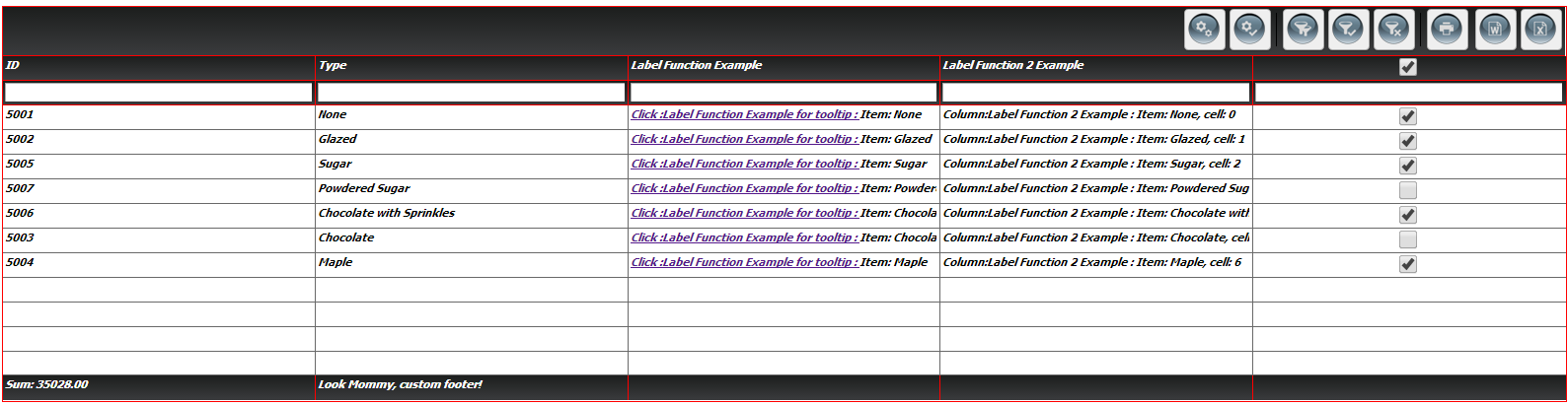
When you run this, you should see:
The entire list of options is quite extensive, and is fully documented here: http://htmltreegrid.com/docs/classes/flexiciousNmsp.FlexDataGrid.html
Below is the entire code for what we have so far:
<!doctype html>
<html lang="en" ng-app="myApp">
<head>
<meta charset="utf-8">
<title>Simple</title>
<!--These are jquery and plugins that we use from jquery-->
<script type="text/javascript" src="http://www.htmltreegrid.com/demo/external/js/adapters/jquery/jquery-1.8.2.js"></script>
<script type="text/javascript" src="http://www.htmltreegrid.com/demo/external/js/adapters/jquery/jquery-ui-1.9.1.custom.min.js"></script>
<script type="text/javascript" src="http://www.htmltreegrid.com/demo/external/js/adapters/jquery/jquery.maskedinput-1.3.js"></script>
<script type="text/javascript" src="http://www.htmltreegrid.com/demo/external/js/adapters/jquery/jquery.watermarkinput.js"></script>
<script type="text/javascript" src="http://www.htmltreegrid.com/demo/external/js/adapters/jquery/jquery.ui.menu.js"></script>
<script type="text/javascript" src="http://www.htmltreegrid.com/demo/external/js/adapters/jquery/jquery.toaster.js"></script>
<!--End-->
<!--These are specific to htmltreegrid-->
<script type="text/javascript" src="http://www.htmltreegrid.com/demo/minified-compiled-jquery.js"></script>
<script type="text/javascript" src="http://www.htmltreegrid.com/demo/examples/js/Configuration.js"></script>
<script type="text/javascript" src="http://www.htmltreegrid.com/demo/themes.js"></script>
<!--End-->
<!--css imports-->
<link rel="stylesheet" href="http://www.htmltreegrid.com/demo/flexicious/css/flexicious.css"
type="text/css" />
<link rel="stylesheet" href="http://www.htmltreegrid.com/demo/external/css/adapter/jquery/jquery-ui-1.9.1.custom.min.css"
type="text/css" />
<!--End-->
<style>
.flexiciousGrid .flexDataGridCell .cellRenderer
{
font-size: 12;
font-weight: bold;
font-style: italic;
font-family: Tahoma;
}
.whiteText
{
color:#ffffff;
}
</style>
<script type="text/javascript">
flexiciousNmsp.themes.push(
{id:'redAndBlack', name:'redAndBlack',
styles:{
/**
* Usually the toolbar root is the same as the images root, but for some custom themes, we have their own icons.
*/
toolbarImagesRoot:flexiciousNmsp.Constants.IMAGE_PATH + "/themeIcons/itunes/32",
pagerRowHeight : 50,
pagerStyleName:"whiteText largeIcons",
headerStyleName:"whiteText",
columnGroupStyleName:"whiteText",
footerStyleName:"whiteText",
alternatingItemColors: [0xFFFFFF, 0xFFFFFF],
alternatingTextColors: [0x000000, 0x000000],
selectionColor: [0xFABB39, 0xFABB39],
rollOverColor: 0xCEDBEF,
headerRollOverColors: [0x1C1E1D, 0x3A3B3D],
headerColors: [0x1C1E1D, 0x3A3B3D],
columnGroupRollOverColors: [0x1C1E1D, 0x3A3B3D],
columnGroupColors: [0x1C1E1D, 0x3A3B3D],
pagerRollOverColors: [0x1C1E1D, 0x3A3B3D],
pagerColors: [0x1C1E1D, 0x3A3B3D],
footerRollOverColors: [0x1C1E1D, 0x3A3B3D],
footerColors: [0x1C1E1D, 0x3A3B3D],
filterRollOverColors: [0x1C1E1D, 0x3A3B3D],
filterColors: [0x1C1E1D, 0x3A3B3D],
fixedColumnFillColors: [0xEFEFEF, 0xEFEFEF],
activeCellColor: 0xB7DBFF,
rendererRollOverColors: [0xFFFFFF, 0xFFFFFF],
rendererColors: [0xFFFFFF,0xFFFFFF],
textSelectedColor:0x000000,
textRollOverColor:0x000000,
borderColor: 0xFF0000,
columnGroupVerticalGridLineColor: 0xFF0000,
columnGroupVerticalGridLines:true,
columnGroupVerticalGridLineThickness:1,
columnGroupHorizontalGridLineColor: 0xFF0000,
columnGroupHorizontalGridLines:true,
columnGroupHorizontalGridLineThickness:1,
columnGroupDrawTopBorder:false,
headerVerticalGridLineColor: 0xFF0000,
headerVerticalGridLines:true,
headerVerticalGridLineThickness:1,
headerHorizontalGridLineColor: 0xFF0000,
headerHorizontalGridLines:true,
headerHorizontalGridLineThickness:1,
headerDrawTopBorder:false,
headerSortSeparatorRight:16,
filterVerticalGridLineColor: 0xFF0000,
filterVerticalGridLines:true,
filterVerticalGridLineThickness:1,
filterHorizontalGridLineColor: 0xFF0000,
filterHorizontalGridLines:true,
filterHorizontalGridLineThickness:1,
filterDrawTopBorder:false,
footerVerticalGridLineColor: 0xFF0000,
footerVerticalGridLines:true,
footerVerticalGridLineThickness:1,
footerHorizontalGridLineColor: 0xFF0000,
footerHorizontalGridLines:false,
footerHorizontalGridLineThickness:1,
footerDrawTopBorder:false,
pagerVerticalGridLineColor: 0xFF0000,
pagerVerticalGridLines:true,
pagerVerticalGridLineThickness:1,
pagerHorizontalGridLineColor: 0xFF0000,
pagerHorizontalGridLines:true,
pagerHorizontalGridLineThickness:1,
rendererVerticalGridLineColor: 0xFF0000,
rendererVerticalGridLines:true,
rendererVerticalGridLineThickness:1,
rendererHorizontalGridLineColor: 0xFF0000,
rendererHorizontalGridLines:true,
rendererHorizontalGridLineThickness:1,
rendererDrawTopBorder:false,
}
})
var myCompanyNameSpace = {};
myCompanyNameSpace.labelFunctionExample = function (item, column) {
var html = "<a href='#' onclick='showTooltip(this)'> Click :"+column.getHeaderText()+" for tooltip : </a> Item: " + item.type ;
return html;
};
myCompanyNameSpace.labelFunction2Example = function (item, column, cell) {
var html = "<b> Column:"+column.getHeaderText()+" : </b> Item: " + item.type + ", cell: " + cell.rowInfo.rowPositionInfo.getRowIndex();
return html;
};
myCompanyNameSpace.customFooterFunction = function () {
var html = "<div> Look Mommy, custom footer!</div>";
return html;
};
function showTooltip(trigger) {
alert(" Show Tooltip for " + trigger.parentNode.parentNode.component.rowInfo.getData().type)
}
/**
* Flexicious
* Copyright 2011, Flexicious LLC
*/
(function(window)
{
"use strict";
var CheckBoxRenderer, uiUtil = flexiciousNmsp.UIUtils, flxConstants = flexiciousNmsp.Constants;
/**
* A CheckBoxRenderer is a custom item renderer, that defines how to use custom cells with logic that you can control
* @constructor
* @namespace flexiciousNmsp
* @extends UIComponent
*/
CheckBoxRenderer=function(){
//make sure to call constructor
flexiciousNmsp.UIComponent.apply(this,["input"]);//second parameter is the tag name for the dom element.
this.domElement.type = "checkbox"; //so our input element becomes a checkbox;
/**
* This is a getter/setter for the data property. When the cell is created, it belongs to a row
* The data property points to the item in the grids dataprovider that is being rendered by this cell.
* @type {*}
*/
this.data=null;
//the add evt listener will basically proxy all DomEvents to your code to handle.
this.addEventListener(this,flxConstants.EVENT_CHANGE,this.onChange);
};
myCompanyNameSpace.CheckBoxRenderer = CheckBoxRenderer; //add to name space
CheckBoxRenderer.prototype = new flexiciousNmsp.UIComponent(); //setup hierarchy
CheckBoxRenderer.prototype.typeName = CheckBoxRenderer.typeName = 'CheckBoxRenderer';//for quick inspection
CheckBoxRenderer.prototype.getClassNames=function(){
return ["CheckBoxRenderer","UIComponent"]; //this is a mechanism to replicate the "is" and "as" keywords of most other OO programming languages
};
/**
* This is important, because the grid looks for a "setData" method on the renderer.
* In here, we intercept the call to setData, and inject our logic to populate the text input.
* @param val
*/
CheckBoxRenderer.prototype.setData=function(val){
flexiciousNmsp.UIComponent.prototype.setData.apply(this,[val]);
var cell = this.parent; //this is an instance of FlexDataGridDataCell (For data rows)
var column = cell.getColumn();//this is an instance of FlexDataGridColumn.
this.domElement.checked=this.data[column.getDataField()];
};
/**
* This event is dispatched when the user clicks on the icon. The event is actually a flexicious event, and has a trigger event
* property that points back to the original domEvent.
* @param event
*/
CheckBoxRenderer.prototype.onChange=function(evt){
//in the renderer, you have the handle to the cell that the renderer belongs to, via the this.parent property that you inherit from flexiciousNmsp.UIComponent.
var cell = this.parent; //this is an instance of FlexDataGridDataCell (For data rows)
var column = cell.getColumn();//this is an instance of FlexDataGridColumn.
this.data[column.getDataField()]=this.domElement.checked;//we use the dom element to wire back the value to the data object.
};
//This sets the inner html, and grid will try to set it. Since we are an input field, IE 8 will complain. So we ignore it since we dont need it anyway.
CheckBoxRenderer.prototype.setText=function(val){
};
}(window));
/**
* Flexicious
* Copyright 2011, Flexicious LLC
*/
(function(window)
{
"use strict";
var CheckBoxHeaderRenderer, uiUtil = flexiciousNmsp.UIUtils, flxConstants = flexiciousNmsp.Constants;
/**
* A CheckBoxHeaderRenderer is a custom item renderer, that you can use in a header cell. In this case, we customize the header
* so that instead of showing a header label, we show a checkbox that switches the dataField flag on all items.
* @constructor
* @namespace flexiciousNmsp
* @extends UIComponent
*/
CheckBoxHeaderRenderer=function(){
//make sure to call constructor
flexiciousNmsp.UIComponent.apply(this,["input"]);//second parameter is the tag name for the dom element.
this.domElement.type = "checkbox"; //so our input element becomes a checkbox;
this.domElement.checked=true;
//the add event listener will basically proxy all DomEvents to your code to handle.
this.addEventListener(this,flxConstants.EVENT_CHANGE,this.onChange);
};
myCompanyNameSpace.CheckBoxHeaderRenderer = CheckBoxHeaderRenderer; //add to name space
CheckBoxHeaderRenderer.prototype = new flexiciousNmsp.UIComponent(); //setup hierarchy
CheckBoxHeaderRenderer.prototype.typeName = CheckBoxHeaderRenderer.typeName = 'CheckBoxHeaderRenderer';//for quick inspection
CheckBoxHeaderRenderer.prototype.getClassNames=function(){
return ["CheckBoxHeaderRenderer","UIComponent"]; //this is a mechanism to replicate the "is" and "as" keywords of most other OO programming languages
};
/**
* This event is dispatched when the user clicks on the icon. The event is actually a flexicious event, and has a trigger event
* property that points back to the original domEvent.
* @param event
*/
CheckBoxHeaderRenderer.prototype.onChange=function(event){
//in the renderer, you have the handle to the cell that the renderer belongs to, via the this.parent property that you inherit from flexiciousNmsp.UIComponent.
var cell = this.parent; //this is an instance of FlexDataGridDataCell (For data rows)
var column = cell.getColumn();//this is an instance of FlexDataGridColumn.
//var dp = cell.level.getGrid().getDataProvider();//this is a pointer back to the grid and its dataprovider.
var dp=this.data;//for header cells, specifically in case of nested grids, the data property is a pointer back to the top level array, or the children array
if(this.data.hasOwnProperty("deals")){
//this means we are at a inner level checkbox header
dp=this.data.deals;
}
//based upon which level this renderer appears.
for (var i=0;i<dp.length;i++){
dp[i][column.getDataField()] = this.domElement.checked;
}
column.level.grid.refreshCells();//this will re-render the cells.
};
//This sets the inner html, and grid will try to set it. Since we are an input field, IE 8 will complain. So we ignore it since we dont need it anyway.
CheckBoxHeaderRenderer.prototype.setText=function(val){
};
}(window));
$(document).ready(function(){
var grid = new flexiciousNmsp.FlexDataGrid(document.getElementById("gridContainer"),
{
configuration: '<grid id="grid" enablePrint="true" enablePreferencePersistence="true" enableExport="true" forcePagerRow="true" pageSize="50" enableFilters="true" enableFooters="true" >' +
' <level>' +
' <columns>' +
' <column dataField="id" headerText="ID" filterControl="TextInput" filterOperation="Contains" footerLabel="Sum: " footerOperation="sum" footerOperationPrecision="2"/>' +
' <column dataField="type" headerText="Type" filterControl="TextInput" filterOperation="Contains" footerLabelFunction="myCompanyNameSpace.customFooterFunction"/>' +
' <column dataField="" headerText="Label Function Example" enableCellClickRowSelect="false" filterControl="TextInput" filterOperation="Contains" labelFunction="myCompanyNameSpace.labelFunctionExample"/>' +
' <column dataField="" headerText="Label Function 2 Example" filterControl="TextInput" filterOperation="Contains" labelFunction2="myCompanyNameSpace.labelFunction2Example"/>' +
' <column dataField="active" headerText="Item Renderer Example" headerRenderer="myCompanyNameSpace.CheckBoxHeaderRenderer" filterControl="TextInput" filterOperation="Contains" itemRenderer="myCompanyNameSpace.CheckBoxRenderer"/>' +
' </columns>' +
' </level>' +
' ' +
' </grid>',
dataProvider: [
{ "id": "5001", "type": "None", "active" : true },
{ "id": "5002", "type": "Glazed" , "active" : true},
{ "id": "5005", "type": "Sugar" , "active" : true},
{ "id": "5007", "type": "Powdered Sugar" , "active" : false},
{ "id": "5006", "type": "Chocolate with Sprinkles" , "active" : true},
{ "id": "5003", "type": "Chocolate" , "active" : false},
{ "id": "5004", "type": "Maple" , "active" : true}
],
styles: flexiciousNmsp.UIUtils.getThemeById('redAndBlack').styles
});
});
</script>
</head>
<body>
<div id="gridContainer" style="height: 400px; width: 100%;">
</div>
</body>
</html>