Custom Renderers
Lets take a quick look at what a custom item renderer looks like. Note, this is a renderer that displays a data cell, but the same concept can be used to render custom interactive content in header, footer, filter, pager, as well as level renderer cells:
This is a renderer that uses a text input to render the data, instead of HTML label. Technically, you could just use a labelFunction and write out the HTML for the text input, but by having a renderer class do this, you have more control over interaction, as well as a handle to the cell that is rendering the data.
/**
* Flexicious
* Copyright 2011, Flexicious LLC
*/
(function(window)
{
"use strict";
var TextInputRenderer, uiUtil = flexiciousNmsp.UIUtils, flxConstants = flexiciousNmsp.Constants;
/**
* A TextInputRenderer is a custom item renderer, that defines how to use custom cells with logic that you can control
* @constructor
* @namespace flexiciousNmsp
* @extends UIComponent
*/
TextInputRenderer=function(){
//make sure to call constructor
flexiciousNmsp.UIComponent.apply(this,["input"]);//second parameter is the tag name for the dom element.
/**
* This is a getter/setter for the data property. When the cell is created, it belongs to a row
* The data property points to the item in the grids dataprovider that is being rendered by this cell.
* @type {*}
*/
this.data=null;
//the add event listener will basically proxy all DomEvents to your code to handle.
this.addEventListener(this,flxConstants.EVENT_CHANGE,this.onChange);
};
myCompanyNameSpace.ItemRenderers_TextInputRenderer = TextInputRenderer; //add to name space
TextInputRenderer.prototype = new flexiciousNmsp.UIComponent(); //setup hierarchy
TextInputRenderer.prototype.typeName = TextInputRenderer.typeName = 'TextInputRenderer';//for quick inspection
TextInputRenderer.prototype.getClassNames=function(){
return ["TextInputRenderer","UIComponent"]; //this is a mechanism to replicate the "is" and "as" keywords of most other OO programming languages
};
TextInputRenderer.prototype.setWidth=function(w){
flexiciousNmsp.UIComponent.prototype.setWidth.apply(this,[w]);
}
/**
* This is important, because the grid looks for a "setData" method on the renderer.
* In here, we intercept the call to setData, and inject our logic to populate the text input.
* @param val
*/
TextInputRenderer.prototype.setData=function(val){
flexiciousNmsp.UIComponent.prototype.setData.apply(this,[val]);
this.domElement.value=val.legalName;
};
/**
* This event is dispatched when the user clicks on the icon. The event is actually a flexicious event, and has a trigger event
* property that points back to the original domEvent.
* @param event
*/
TextInputRenderer.prototype.onChange=function(evt){
this.data.legalName=this.domElement.value;//we use the dom element to wire back the value to the data object.
var cell = this.parent; //this is an instance of FlexDataGridDataCell (For data rows)
var column = cell.getColumn();//this is an instance of FlexDataGridColumn.
column.level.grid.refreshCells();//this will re-render the cells.
}
//This sets the inner html, and grid will try to set it. Since we are an input field, IE 8 will complain. So we ignore it since we dont need it anyway.
TextInputRenderer.prototype.setText=function(val){
};
}(window));
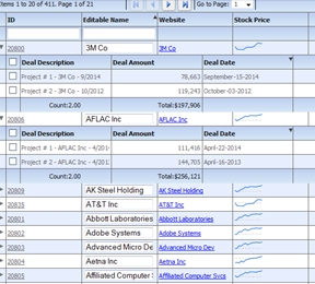
The way you would associate this renderer to a column is this:
' <column headerText="Editable Name" dataField="legalName" '+
' filterControl="TextInput" filterOperation="BeginsWith" paddingLeft="5" paddingBottom="5" '+
' paddingRight="8" enableCellClickRowSelect="false" itemRenderer="myCompanyNameSpace.ItemRenderers_TextInputRenderer">'+
' </column>'+
Just like you associate renderers with data cells, you can do the same with header, footer, as well as filter cells.
Lets take a look at what a header renderer looks like:
/**
* Flexicious
* Copyright 2011, Flexicious LLC
*/
(function(window)
{
"use strict";
var CheckBoxHeaderRenderer, uiUtil = flexiciousNmsp.UIUtils, flxConstants = flexiciousNmsp.Constants;
/**
* A CheckBoxHeaderRenderer is a custom item renderer, that you can use in a header cell. In this case, we customize the header
* so that instead of showing a header label, we show a checkbox that switches the dataField flag on all items.
* @constructor
* @namespace flexiciousNmsp
* @extends UIComponent
*/
CheckBoxHeaderRenderer=function(){
//make sure to call constructor
flexiciousNmsp.UIComponent.apply(this,["input"]);//second parameter is the tag name for the dom element.
this.domElement.type = "checkbox"; //so our input element becomes a checkbox;
this.domElement.checked=true;
//the add event listener will basically proxy all DomEvents to your code to handle.
this.addEventListener(this,flxConstants.EVENT_CHANGE,this.onChange);
};
myCompanyNameSpace.ItemRenderers_CheckBoxHeaderRenderer = CheckBoxHeaderRenderer; //add to name space
CheckBoxHeaderRenderer.prototype = new flexiciousNmsp.UIComponent(); //setup hierarchy
CheckBoxHeaderRenderer.prototype.typeName = CheckBoxHeaderRenderer.typeName = 'CheckBoxHeaderRenderer';//for quick inspection
CheckBoxHeaderRenderer.prototype.getClassNames=function(){
return ["CheckBoxHeaderRenderer","UIComponent"]; //this is a mechanism to replicate the "is" and "as" keywords of most other OO programming languages
};
/**
* This event is dispatched when the user clicks on the icon. The event is actually a flexicious event, and has a trigger event
* property that points back to the original domEvent.
* @param event
*/
CheckBoxHeaderRenderer.prototype.onChange=function(event){
//in the renderer, you have the handle to the cell that the renderer belongs to, via the this.parent property that you inherit from flexiciousNmsp.UIComponent.
var cell = this.parent; //this is an instance of FlexDataGridDataCell (For data rows)
var column = cell.getColumn();//this is an instance of FlexDataGridColumn.
//var dp = cell.level.getGrid().getDataProvider();//this is a pointer back to the grid and its dataprovider.
var dp=this.data;//for header cells, specifically in case of nested grids, the data property is a pointer back to the top level array, or the children array
if(this.data.hasOwnProperty("deals")){
//this means we are at a inner level checkbox header
dp=this.data.deals;
}
//based upon which level this renderer appears.
for (var i=0;i<dp.length;i++){
dp[i][column.getDataField()] = this.domElement.checked;
}
column.level.grid.refreshCells();//this will re-render the cells.
};
//This sets the inner html, and grid will try to set it. Since we are an input field, IE 8 will complain. So we ignore it since we dont need it anyway.
CheckBoxHeaderRenderer.prototype.setText=function(val){
};
}(window));
Again, you can specify HTML for the headerText, but you may choose to use a JavaScript based renderer if you need more control over the interaction of the component within the HTML.
In the Demo Console, you can review the "Item Renderers" example for a running demo of how to use renderers.
The same concept applies to other kinds of renderers, including:
For example, lets take a quick look at how we define the nextLevelRenderer. In the demo console, there is a running version of this example, that shows the inner level custom display:
/**
* Flexicious
* Copyright 2011, Flexicious LLC
*/
(function(window)
{
"use strict";
var NextLevelRenderer2, uiUtil = flexiciousNmsp.UIUtils, flxConstants = flexiciousNmsp.Constants;
/**
* A NextLevelRenderer2 is a custom item renderer, that defines how to use custom cells with logic that you can control
* @constructor
* @namespace flexiciousNmsp
* @extends UIComponent
*/
NextLevelRenderer2=function(){
//make sure to call constructor
flexiciousNmsp.UIComponent.apply(this);//second parameter is the tag name for the dom element.
this.setHeight(50);
/**
* This is a getter/setter for the data property. When the cell is created, it belongs to a row
* The data property points to the item in the grids dataprovider that is being rendered by this cell.
* @type {*}
*/
this.data=null;
};
myCompanyNameSpace.LevelRenderers2_NextLevelRenderer2 = NextLevelRenderer2; //add to name space
NextLevelRenderer2.prototype = new flexiciousNmsp.UIComponent(); //setup hierarchy
NextLevelRenderer2.prototype.typeName = NextLevelRenderer2.typeName = 'NextLevelRenderer2';//for quick inspection
NextLevelRenderer2.prototype.getClassNames=function(){
return ["NextLevelRenderer2","UIComponent"]; //this is a mechanism to replicate the "is" and "as" keywords of most other OO programming languages
};
/**
* This is important, because the grid looks for a "setData" method on the renderer.
* In here, we intercept the call to setData, and inject our logic to render the html for the renderer.
* @param val
*/
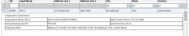
NextLevelRenderer2.prototype.setData=function(val){
flexiciousNmsp.UIComponent.prototype.setData.apply(this,[val]);
var html = "<fieldset><legend>Orgainzation Information</legend><table style='width:100%'><tr>" +
"<td style='border:solid 1px #000000'>Organization Name "+val.legalName+" </td>" +
"<td style='border:solid 1px #000000'>Sales Contact "+val.salesContact.getDisplayName()+" </td>" +
"<td style='border:solid 1px #000000'>Sales Contact Phone:"+val.salesContact.telephone+" </td>" +
"</tr><tr>" +
"<td style='border:solid 1px #000000''>Annual Revenue:"+flexiciousNmsp.UIUtils.formatCurrency(val.annualRevenue)+" </td>" +
"<td style='border:solid 1px #000000''>EPS:"+flexiciousNmsp.UIUtils.formatCurrency(val.earningsPerShare)+" </td>" +
"<td style='border:solid 1px #000000''>Last Stock Price:"+flexiciousNmsp.UIUtils.formatCurrency(val.lastStockPrice)+" </td>" +
"</tr><tr>" +
"<td style='border:solid 1px #000000''>Employees:"+val.numEmployees+" </td>" +
"<td colspan='2' style='border:solid 1px #000000''>Address:"+val.headquarterAddress.toDisplayString()+" </td>" +
"</tr></table></fieldset>";
this.setInnerHTML(html);
}
}(window));
myCompanyNameSpace.levelRenderers2_creationCompleteHandler =function (evt){
grid.validateNow();
grid.expandAll();
}
myCompanyNameSpace.SAMPLE_CONFIGS["LevelRenderers2"]='<grid id="grid" enablePrint="true" enableDrillDown="true"'+
' enablePreferencePersistence="true"'+
' enableExport="true" enableCopy="true"'+
' preferencePersistenceKey="levelRenderers2" on'+flexiciousNmsp.Constants.EVENT_CREATION_COMPLETE+'="myCompanyNameSpace.levelRenderers2_creationCompleteHandler">'+
' <level enableFilters="true" enablePaging="true" rendererHorizontalGridLines="true" ' +
' rendererVerticalGridLines="true" pageSize="20" childrenField="deals" enableFooters="true" selectedKeyField="id" ' +
' nextLevelRenderer="myCompanyNameSpace.LevelRenderers2_NextLevelRenderer2" levelRendererHeight="120">'+
' <columns>'+
' <column type="checkbox" />'+
' <column enableCellClickRowSelect="false" columnWidthMode="fitToContent" selectable="true" dataField="id" headerText="ID" filterControl="TextInput"/>'+
' <column truncateToFit="true" enableCellClickRowSelect="false" columnWidthMode="fitToContent" selectable="true" dataField="legalName" headerText="Legal Name"/>'+
' <column dataField="headquarterAddress.line1" headerText="Address Line 1" footerLabel="Count:" footerOperation="count"/>'+
' <column dataField="headquarterAddress.line2" headerText="Address Line 2"/>'+
' <column dataField="headquarterAddress.city.name" headerText="City" filterControl="MultiSelectComboBox" filterComboBoxBuildFromGrid="true" filterComboBoxWidth="150"/>'+
' <column dataField="headquarterAddress.state.name" headerText="State" filterControl="MultiSelectComboBox" filterComboBoxBuildFromGrid="true" filterComboBoxWidth="150"/>'+
' <column dataField="headquarterAddress.country.name" headerText="Country" filterControl="MultiSelectComboBox" filterComboBoxBuildFromGrid="true" filterComboBoxWidth="150"/>'+
' </columns>'+
' </level>'+
' </grid>';