Grid Architecture
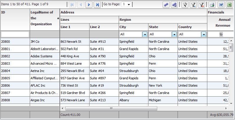
The Grid is an extremely versatile and powerful control, able to display both hierarchical, as well as flat data. For Flat data, the grid resembles a table, while for hierarchical data, the grid resembles a tree with columns.
This is what a flat grid looks like:
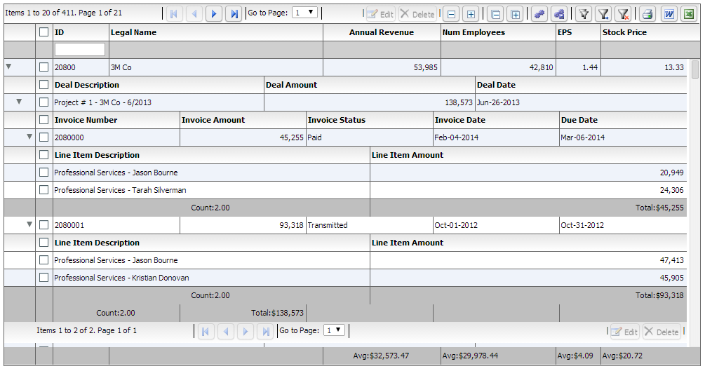
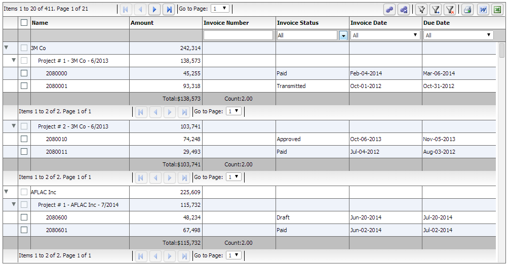
With hierarchy, there are two different modes, nested and grouped. Nested has a series of subgrids (grids within grids) while grouped is a traditional tree with a single set of top level columns:
Nested:
Grouped:
One of the most important concepts behind the Architecture of the grid arose from the fundamental requirement that we created the product for - that is display of Heterogeneous Hierarchical Data. The notion of nested levels is baked in to the grid via the "columnLevel" property. This is a property of type "FlexDataGridColumnLevel". This grid always has at least one column level. This is also referred to as the top level, or the root level. In flat grids (non hierarchical), this is the only level. But in nested grids, you could have any number of nested levels. The columns collection actually belongs to the columnLevel, and since there is one root level, the columns collection of the grid basically points to the columns collection of this root level.
The FlexDataGridColumnLevel class has a "nextLevel" property, which is a pointer to another instance of the same class, or a "nextLevelRenderer" property, which is a reference to a ClassFactory the next level. Please note, currently, if you specify nextLevelRenderer, the nextLevel is ignored. This means, at the same level, you cannot have both a nested subgrid as well as a level renderer. Bottom line - use nextLevelRenderer only at the innermost level. Our examples demonstrate this.
Another one important feature of the product is left and right locked columns, as well as a locked header and footer. This complicates the grid structure a little bit like below:
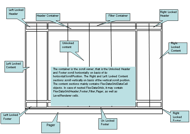
You can access each of the above container sections via the following properties:
· leftLockedHeader (com.flexicious.nestedtreedatagrid.cells.LockedContent) - The container for the left locked filter and header cells. This is an instance of the LockedContent class, which basically is an extended UIComponent that manages the filter and footer cell visiblity, heights, and the y positions.
· leftLockedContent (com.flexicious.nestedtreedatagrid.cells.ElasticContainer) - The container for the left locked data cells. This is an instance of the ElasticContainer class, which basically attaches to the owner component (which is the bodyContainer) and scrolls vertically along with it. The horizontal scroll of this component is set to off)
· leftLockedFooter (com.flexicious.nestedtreedatagrid.cells.LockedContent)
· filterContainer (com.flexicious.nestedtreedatagrid.cells. FlexDataGridHeaderContainer)
· headerContainer (com.flexicious.nestedtreedatagrid.cells.FlexDataGridHeaderContainer)
· bodyContainer(com.flexicious.nestedtreedatagrid.cells. FlexDataGridBodyContainer)
· rightLockedHeader (com.flexicious.nestedtreedatagrid.cells.LockedContent)
· rightLockedContent (com.flexicious.nestedtreedatagrid.cells.ElasticContainer)
· rightLockedFooter (com.flexicious.nestedtreedatagrid.cells.LockedContent)
· pagerContainer (com.flexicious.nestedtreedatagrid.cells. FlexDataGridHeaderContainer)
You should normally not need to touch any of these properties. But they're there if you need to. Also, if you need a handle on the actual cells, you should go to the rows collection of filterContainer, headerContainer, bodyContainer, footerContainer, or pagerContainer. Each of these has a rows property, which in case of all but the bodyContainer is collection with 1 Item, of type RowInfo. The rowInfo object, that has the cells collection. The Cells are basically a collection of ComponentInfo object, that each contain a pointer to the actual component which is an instance of on of the subclasses of the FlexDataGridCell object. The FlexDataGridCell has a renderer property, which is the actual component being displayed. These concrete classes that inherit from FlexDataGridCell are:
· FlexDataGridHeaderCell
· FlexDataGridFilterCell
· FlexDataGridFooterCell
· FlexDataGridPagerCell
· FlexDataGridLevelRendererCell
· FlexDataGridExpandCollapseHeaderCell
· FlexDataGridExpandCollapseCell
· FlexDataGridPaddingCell.
Each of the above cells has a renderer property. The renderer is the actual component that is displayed on the UI. The FlexDataGridCell is responsible for sizing, positioning (based on padding), drawing the background, and drawing the borders. In case of the Header, Data or Footer cells the default renderer is a simple Label Control. For Filter, it is an instance of the IFilterControl. For the Pager, it is an IPager control. For the LevelRenderer it is an instance of the Class Factory that you specify in the nextLevelRenderer of the associated column Level. For the ExpandCollapse cells, it will draw an instance of the expand collapse icon on basis of the disclosureIcon style property. All the drawing happens in the drawCell method. It internally calls the drawBackground and drawBorder methods. Usually specifying the style attributes or the cellBackgroud/rowBackground/cellBorder/rowBorder functions is sufficient, but in case its needed, these methods can be overridden in a custom implementation, and this custom implementation can then be hooked in via the dataCellRenderer, headerCellRenderer, footerCellRenderer, pagerCellRenderer, filterCellRender, expandCollapseHeaderCellRenderer,nestIndentPaddingCellRenderer, and expandCollapseCellRenderer of the column or the level. These are discussed in the "Cells And Renderers" section