Text Input Filter
The Text Input filter is the most commonly used filter, so lets take a quick look at the available options.
First, the way you use these controls is that you define which filter you want on the column:
' <column id="colId" dataField="id" headerText="ID" filterControl="TextInput"
With each of the filter controls, there are pass through properties that enable various options on the filter controls. For example, for TextInput, the properties in red can be used to customize its behavior:
' <column id="colId" dataField="id" headerText="ID" filterControl="TextInput" filterWaterMark="Search"'+
' columnLockMode="left" filterIcon="'+ myCompanyNameSpace.IMAGE_PATH +'/search_clear.png"'+
' enableFilterAutoComplete="true" clearFilterOnIconClick="true"/>'+
As you can imagine, we set the following properties here:
In addition, there is also the filterOperation which you can use to control the behavior. This is the operator to apply when doing the conversion. See FILTER_OPERATION_TYPE constant values from com.flexicious.grids.filters.FilterExpression. Here are a list of options:
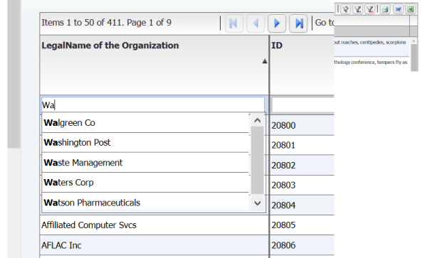
This is what this looks like:
One final aspect of the TextInput Filter, is that it implements IDelayedChange. This is a marker interface to indicate that the object support a delayed changed event Used in filtering - so we dont trigger the filter event for every key stroke in the textbox. It has a delay duration to control how long to wait before we trigger the filter.
//BEING DELAYED CHANGE PROPERTIES
/**
* The amount of time (in milliseconds) to wait before dispatching the DELAY_CHANGE event.
* @property delayDuration
* @type int
* @default 500
*/
this.delayDuration= 500; // delay in milliseconds before "delayedChange" event is dispatched.
/**
* Whether or not to enable the DELAY_CHANGE event.
* @property enableDelayChange
* @type int
* @default 500
*/
this.enableDelayChange= true;
//END DELAYED CHANGE PROPERTIES
//===========DELAYED CHANGE INCLUDE======================//
TextInput.prototype.dispatchEvent=function(evt){
if(this.enableDelayChange)
{
if((evt.type == flxConstants.EVENT_KEY_UP && (this.textBoxValue!=this.getTextBox().value)) || evt.keyCode==8)
{
// if change event, intercept
if (this.timerInstance == null )
{
this.timerInstance = new flexiciousNmsp.Timer(this.delayDuration,1);
this.timerInstance.addEventListener(this,flxConstants.EVENT_TIMER_COMPLETE, this.onTimerComplete,false,0,true);
}
this.timerInstance.reset(); // reset if already set...
this.timerInstance.repeatCount = 1;
// starts the timer ticking
this.timerInstance.start();
}
}
return flexiciousNmsp.UIComponent.prototype.dispatchEvent.apply(this,[evt]);
};
TextInput.prototype.onTimerComplete=function (event){
this.dispatchEvent(new flexiciousNmsp.FlexDataGridEvent("delayedChange"));
if(this.timerInstance){
this.timerInstance.stop();
this.timerInstance=null;
}
};
//===========END DELAYED CHANGE INCLUDE======================//
Finally, it does support autocomplete, and by default the list of items in the auto complete are a distinct list of values from the column. However, you can also control the list of items by specifying a filterComboBoxDataProvider, filterComboBoxLabel field and filterComboBoxDataField properties.