Configuration Options – Interactive HTML in cells
In the previous section we look at a very common requirement, one that of formatting column values. We saw that there are numerous ways to customize the content of the cells. We explored a rich API that allows you to pretty much customize every single grid cell.
In this section, let’s take that concept further, and embed interactive content within cells. By interactive content, we mean things like tooltips, programmatic interactive html, etc. We will continue to use the example from the previous section, just enhance the label function like so:
myCompanyNameSpace.labelFunctionExample = function (item, column) {
var html = "<a href='#' onclick='showTooltip(this)'> Click :"+column.getHeaderText()+" for tooltip : </a> Item: " + item.type ;
return html;
};
function showTooltip(trigger) {
alert(" Show Tooltip for " + trigger.parentNode.parentNode.component.rowInfo.getData().type)
}
We will also make one small change to the configuration XML:
' <column dataField="" headerText="Label Function Example" enableCellClickRowSelect="false" filterControl="TextInput" filterOperation="Contains" labelFunction="myCompanyNameSpace.labelFunctionExample"/>' +
And here is what we see:
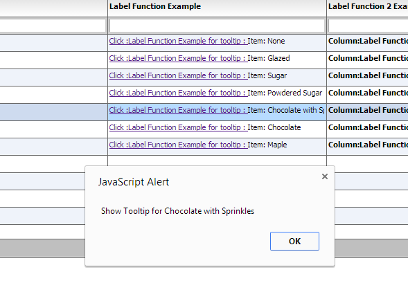
So let’s look at what we did here.
First, we set enableCellClickRowSelect="false"
This prevents the click on the anchor from selecting the row.
Second, in the HTML we generate, we added an onClick handler:
var html = "<a href='#' onclick='showTooltip(this)'> Click :"+column.getHeaderText()+" for tooltip : </a> Item: " + item.type ;
return html;
Finally, we provided the callback for the handler:
function showTooltip(trigger) {
alert(" Show Tooltip for " + trigger.parentNode.parentNode.component.rowInfo.getData().type)
}
There are a few things to keep in mind in this method.