Date Combo Box Filter
Another very useful filter is the DateComboBox filter. This basically lists a series of predefined set of DateFilter options.
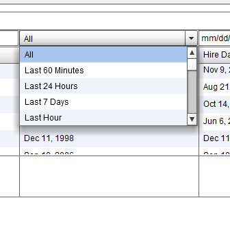
The way you configure a column to have a DateComboBox as the filter is:
' <column dataField="hireDate" headerText="Date" filterControl="DateComboBox"
The following properties are useful when you are using the DateComboBox:
filterDateRangeOptions: List of options that are available in the DateComboBox filter. The default is a blank array which makes all available Date Ranges show up. For a full list of DateRanges, see the DateRange class
Another point to note is that when the user picks the "Custom" date range, the grid will show a popup with two date pickers to pick the date range. You can control the format of the Date Picker by setting the
flexiciousNmsp.Constants.DEFAULT_DATE_FORMAT = "M-dd-yy";
Note that the date format is specific to the library being used. If you use moment.js, the format will be different. For jQuery, we use the built in JQDatePIcker, which has the format described above.