Another very useful filter is the MultiSelectComboBox:
This allows you to select one or more values to search across the column.
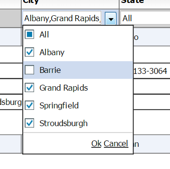
The way you configure a column to have a MultiSelectComboBox as the filter is:
' <column dataField="headquarterAddress.city.name" headerText="City" filterControl="MultiSelectComboBox" filterComboBoxBuildFromGrid="true" filterComboBoxWidth="150"/>'+
The following properties are useful when you are using the MultiSelectComboBox (Some of these also apply to the ComboBox filter control)
- filterComboBoxDataProvider: Dataprovider to use to build the list of values to display in the filter control, only applicable if the filterControl is a ISelectFilterControl, IMultiSelectFilterControl,ISingleSelectFilterControlinherit from ISelectFilterControl, and MultiSelectComboBox RadioButtonList ComboBox DateComboBox all inherently implement ISelectFilterControl. It is not required to set this field. You may set the filterComboBoxBuildFromGrid property to true which will automatically build this collection on basis of distinct values in the grid.
- filterComboBoxLabelField: Used in conjunction with the filterComboBoxDataProvider field, used to set the value of the label field for the associated ISelectFilterControl. The name of the field in filterComboBoxDataProvider array objects to use as the label field. Property; specifies a field in each item to be used as display text. This property takes the value of the field and uses it as the label. The default value is "label". For example, if you set the labelField property to be "name". "Nina" would display as the label for this {name: "Nina", id: 123};
- filterComboBoxDataField: Used in conjunction with the filterComboBoxDataProvider field, used to set the value of the dataField for the associated ISelectFilterControl. The name of the field in filterComboBoxDataProvider array objects to use as the data field. Property; specifies a field in each item to be used as display text. This property takes the value of the field and uses it as the label. The default value is "data". For example, if you set the labelField property to be "id". 123 would be stored as the value {name: "Nina", id: 123};
- filterComboBoxBuildFromGrid: Flag, if set to true, will automatically build this collection on basis of distinct values in the grid. Usually, you would want to set this flag to true, because it automatically builds out the list of distinct items for you, sets the appropriate filterComboBoxDataField, filterComboBoxLabelField, and you do not have to specify a filterComboBoxdataProvider The only scenario where you would want to set this to false, is when you explicitly specify a filterComboBoxDataProvider. This is usually done only when filterPageSortMode=server, because not all the data across the entire dataset is present when you have server paging. The other situation is where you have very large datasets and you don't want the grid to spend time iterating through the dataprovider to identify the unique values.